You’ve got something to sell. Maybe it’s an online course or digital downloads.
Whatever it is, you’re going to need a landing page to sell it.
A landing page is a single web page used to sell a specific product or service. Done right, it will persuade and convert your visitors to click buy.
But where do you start? There are so many landing page builders out there. You don’t want to waste your time and money on the wrong one.
Don’t worry, we’ve done the heavy lifting for you.
Discover the essential features of a landing page builder, as well as our roundup of the five best.
What to look for in a landing page builder?
There are as many landing page builders as grains in the sand — you need to know what to look for. So here are the questions you should ask yourself when you assess editors.
#1 Is it good-looking?
It sounds shallow, but your landing page should be easy on the eye.
Visitors will judge your landing page’s credibility based on its looks within 3.42 seconds.
Choose a landing page builder with beautiful templates or design options.
You can check this by looking through their examples or templates gallery to see if they appeal to you. Pay attention to the layout, typography, forms, and buttons.
Take the time to check a builder’s examples and templates to see if it fits with your own tastes.
#2 Is it easy to use?
Beauty doesn’t always go hand-in-hand with user-friendly. Your time is precious so you need a landing page editor that’s quick to understand.
The best way to know if a builder is easy to use is to test it.
Most landing page builders offer a free trial — so if you’re hesitating between a few options, take them for a test drive. Choose the easiest and fastest builder.
#3 Is it mobile-friendly?
Your customers should be able to enjoy your website whether they’re on a train or in their bath.
For example, Sonia Teach’s How to Find Tutoring Clients Online is beautifully readable on all devices.
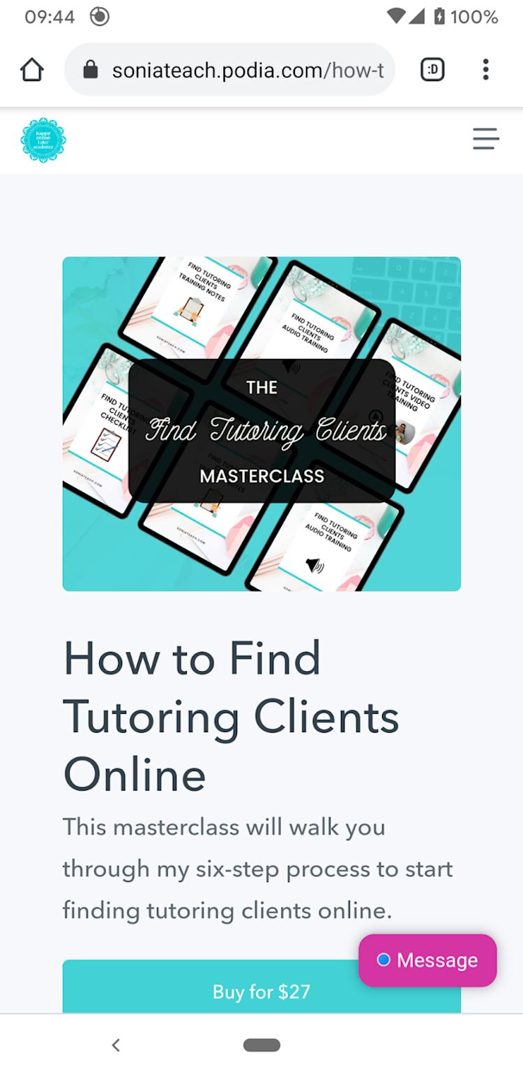
Having a mobile-friendly landing page is also essential for SEO reasons. Google indexes and ranks based on the mobile version of sites.
#4 Does it integrate with other tools?
You’re bound to be using other apps for your business. For example, blogging, email marketing platforms, or SEO tools.
If those features aren’t included in your page builder’s package, or it’s missing from its integration list, fear not. There might be a workaround. Automation tools like Zapier and IFTTT connect apps.
#5 Can you personalize it?
There’s nothing more confusing than a landing page disconnected from the rest of your brand.
71% of companies claim an inconsistent brand confuses your customer and could prevent them from making a purchase.
Ideally, your landing page should fit your brand colors, fonts, and style.
For example, Minessa Konecky has a strong brand; her landing pages need to reflect that. Here’s the landing page for her membership site, The Squad Academy.
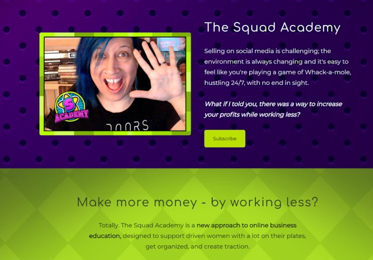
It’s bold and bright and completely matches her main website’s colors and style.

There’s no risk of confusion for her audience; whatever page they’re on, they know it’s Minessa’s work.
Takeaway:
The features and plugins you need from landing page software will vary depending on your business, but these five are an absolute must. You need your landing page builder to be easy to edit, fit with your business, and appeal to your site visitors.
Fortunately, we’ve found five landing page builders that tick every box and more. Let’s dive in.
5 top landing page builders for creators
#1 Podia
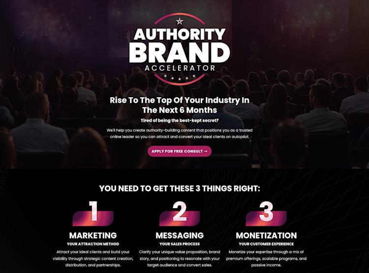
Want a free, easy-to-use landing page creator?
Then you’ll love Podia’s creator-friendly platform. Podia helps people every day sell memberships, online courses, and digital downloads. Find everything you need to grow your platform without the need for plugins or custom code.
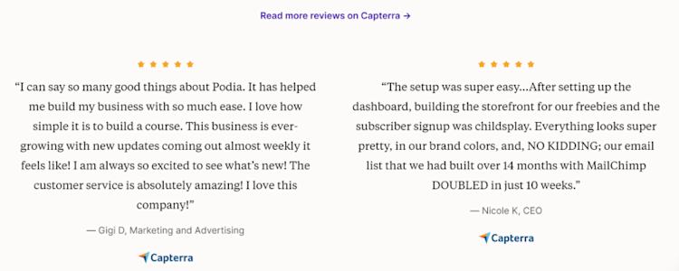
We’re a little biased, so don’t take our word for it. Check out what our users have to say about us.
Podia features:
-
Customizable landing pages
-
Mobile-friendly
-
Integrate your online course, digital products, membership site, and email marketing
-
Messaging widget on the page lets you capture leads
-
Self-host videos
-
Custom URL
-
Affiliate marketing integration
-
Unlimited content, students, emails, and earnings on all plans. No hidden fees.
-
World-class customer service
-
20+ integrations
Who it’s best for:
-
Creators looking for a no-fuss way to sell their digital products, build a website, and manage their online business from one platform
-
Anyone who wants to build beautiful landing pages 100% for free -- without a steep learning curve
Landing page example:
Here’s Deryn Mentock’s landing page, which is personalized with her colors and logo.

Pricing: Podia offers two plans: Mover ($39/month) and Shaker ($89/ month).
Free trial: 30-day free trial so you can test out the features before you join.
Sign up for Podia and start building beautiful landing pages.
#2 Carrd
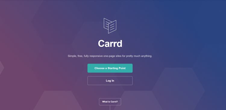
If you’re a beginner and want to dip your toes into the world of landing page building, then Carrd is for you.
Using its templates, you can create sleek landing pages. As your business grows, you might find Carrd’s integrations limited, but as a free landing page option, it’s hard to beat.
Features:
-
Create multiple landing pages
-
Upload images, videos, slideshows, and GIFs
-
Signup forms
-
Widgets for tools like PayPal, Typeform, and Stripe
-
Multiple customizable templates and site elements
Who it’s best for:
-
Freelancers looking for an easy-to-build website at an affordable price
-
Startups looking to test out their ideas before launching them
Landing page example:
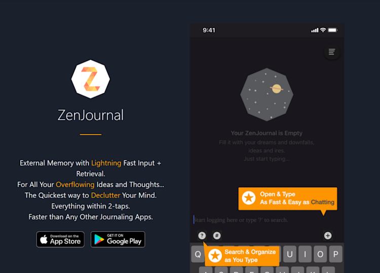
Here’s the Zen Journal, a journaling app using Carrd for its landing page.
Pricing: Free but limited on a standard plan. If you want to create multiple landing pages, white label your site, or integrate other apps, you’ll need to upgrade to a paid plan. There are three paid plans: Pro Lite ($9 a month), Pro Standard ($19 a month), Pro Plus ($49 a month).
Free trial: 7-day free trial. No credit card required.
#3 Leadpages
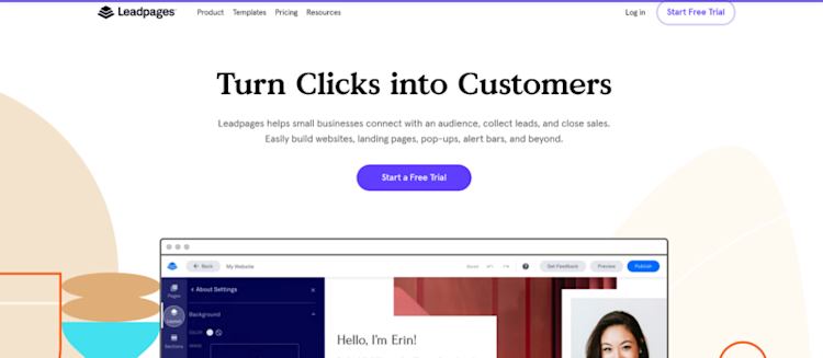
Leadpages’ drag-and-drop builder is a dream for novices as well as more experienced creators. With numerous templates and customization options, you can create enticing landing pages in no time.
Design pop-up messages for your website to encourage further conversions, choosing when and where they appear.
Leadpages also offers the option to A/B test your landing pages — this is when you compare two versions of a landing page to see which one performs better. It’s useful if you want to know which image, copy, or call to action resonates with your visitors.

Features:
-
Built-in conversion guidance
-
Unlimited pages
-
40+ marketing tool integrations, including WordPress, Google Analytics, GetResponse, and Mailchimp
-
Custom domain
-
200+ mobile-friendly landing page templates
-
Easy A/B testing
-
Pop-ups you can funnel into an email list
Who it’s best for:
-
Small businesses who want to add pop-ups and landing pages to their existing website
-
Creators who want to test their pages for conversion rates
Landing page example:
Jeremy Cassell Coaching used Leadpages to capture leads for his whitepaper. It’s integrated into his WordPress site.

Pricing: Three paid options: Standard ($27 a month), Pro ($59), and Advanced ($239).
Free trial: 14-day trial.
#4 Instapage
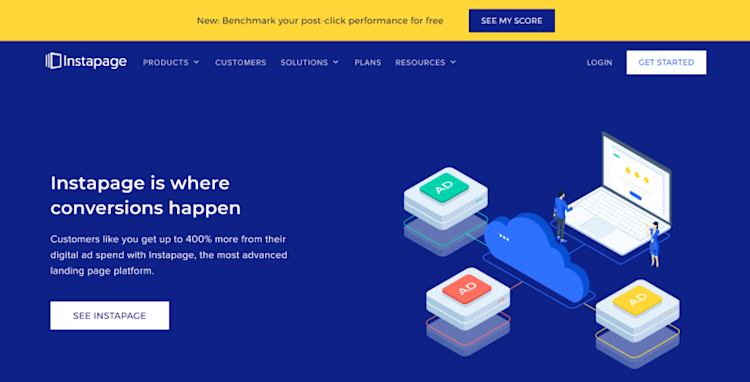
Instapage is a more advanced website builder for creators, and particularly suits those in the ecommerce space.
For instance, it includes features like heat maps. Heat maps allow you to see the “hot” and “cold” areas of your website, i.e., where your visitors go and which sections they avoid. It’s handy if your site receives thousands of visitors per month.
As you can guess, the price tag is heftier than the previous landing page builders. So Instapage only suits small businesses that have experienced significant growth.
Features:
-
Dynamic content that changes depending on the audience
-
AdMap® connects social media ad campaigns to landing pages
-
Landing page tools including A/B test, marketing automation, and heat maps options
-
Robust analytics
-
30 landing pages available
-
Integrates with 40+ marketing tools, including Salesforce and Marketo
Who it’s best for:
-
SaaS startups who want to integrate their landing page in advanced marketing campaigns
-
Small businesses who receive several thousand visitors every month
Landing page example:
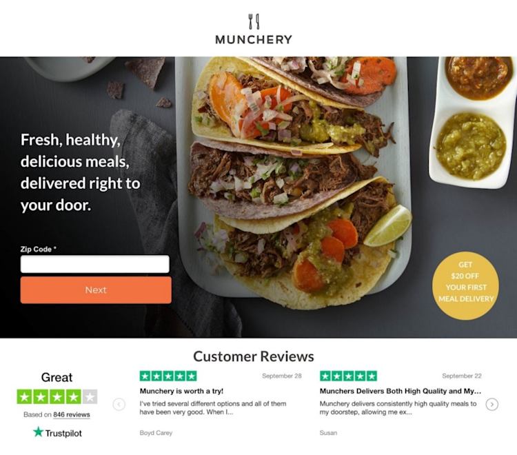
Below is a landing page for the Munchery, which sits alongside hundreds of other landing page examples.
Pricing: $299 a month or $199 (x12) for the year on the Optimizing plan. There is also the option to go for the Converting plan (custom price on request).
Free Trial: 14-day trial.
#5 Unbounce
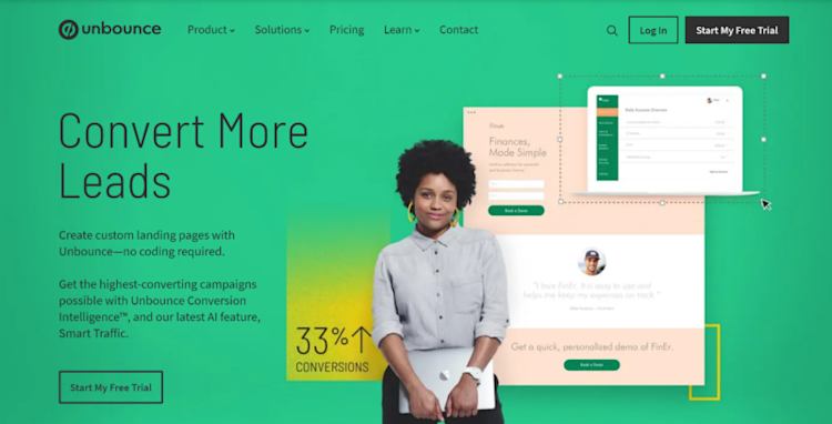
Last but not least, Unbounce is the most established landing page builder on this list. It offers all the classic functionality, such as the drag-and-drop editor and plenty of advanced features.
Like Instapage, this is for websites receiving thousands of visitors every month.
Features:
-
100+ landing page templates
-
Add custom scripts and pixels
-
Customize mobile pages
-
Publish to WordPress in one click
-
Custom landing pages to match your branding
-
Video backgrounds
-
A/B testing
-
Dynamic text replacement depending on your visitor’s search terms
-
Real-time data
-
Pop-ups
-
CRM integration, including Hubspot or Marketo
Who’s it for:
-
Experienced marketers
-
Creators who want to automate more of their lead generation processes
-
Creators with hundreds of daily visitors
Landing page example:
Custom menswear company Indochino uses Unbounce for its landing pages.

Pricing: There are four plans available: Launch ($80 a month), Optimize ($120 a month), Accelerate ($200 a month), and Scale ($300 a month).
Free trial: 14-day trial.
Which of these landing page builders should you choose?
There’s no right or wrong answer to this question. It will ultimately depend on what you’re trying to achieve.
If you want to test out an idea for a landing page without committing too much time and money, then Carrd or Leadpages are your best bet.
Advanced marketers will love the features that Unbounce and Instapage have to offer.
And if you’re a creator who wants an all-in-one solution for your courses, webinars, memberships, and digital downloads, then Podia is the one for you.
Let me show you.
How to build a landing page in Podia
Let’s walk through the steps to create a custom landing page for your business using Podia.
Step 1: Create a new landing page
First things first, you need to log in to your Podia account (or start your free trial now).
Then select “Edit site”.

This will take you to your site, where you can start building the blocks of your landing page.
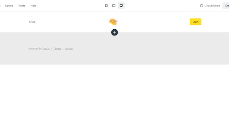
Pressing the plus symbol will bring up options on the left-hand side, including text blocks.
Let’s start with a side-by-side text and image section.
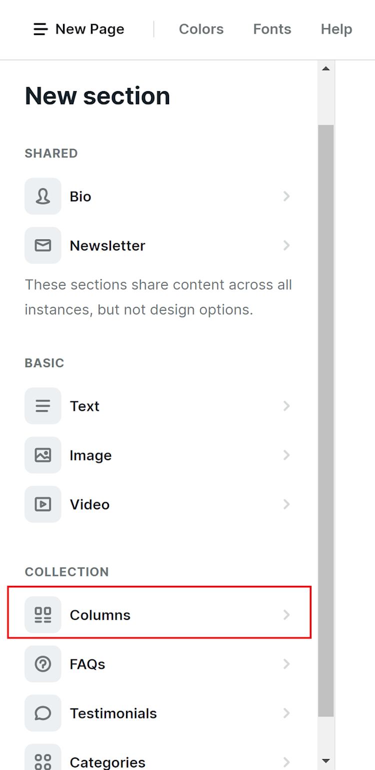
Select “Columns” then “New column”. Add the text or visuals you want.
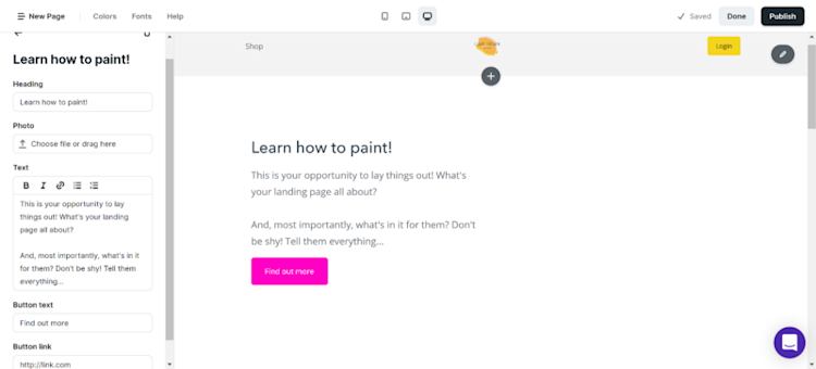
Here’s how I’m filling out the first column.
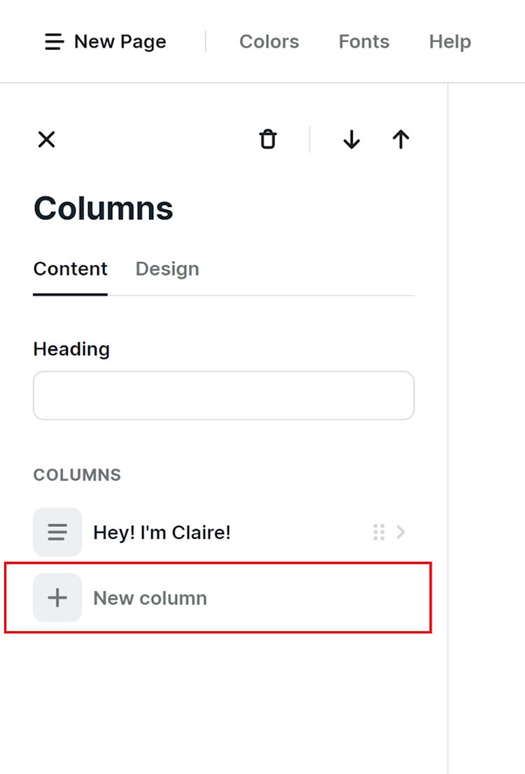
To add the second column, I click the back arrow and choose “New column”.
This time, instead of adding text, I uploaded an image.
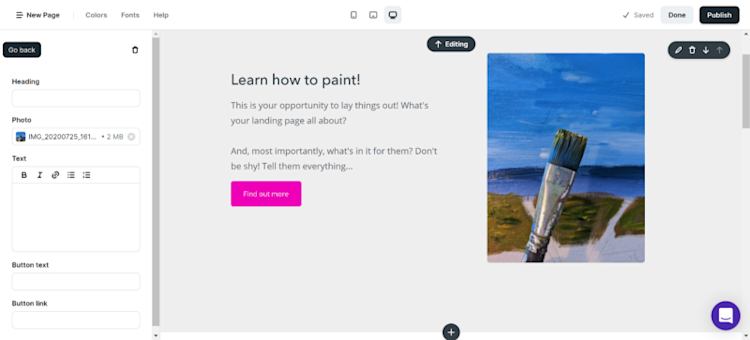
You can use this column feature multiple times throughout to create a sales page that converts.
For example, here’s how Tiffany Waddell Tate designed it to outline the pros and cons of signing up for her Career Maven® academy.
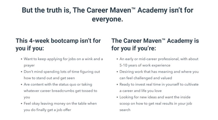
This section helps her visitors decide quickly if her course is the right fit for them.
Meanwhile, BISA Online Courses added a background image to highlight a special offer.

The image makes the section pop on their landing page. But I digress. Let’s move on to the next step.
Step 2: Add a product
A perk of building your landing page on Podia is you can directly integrate your courses, digital products, webinars, and more.
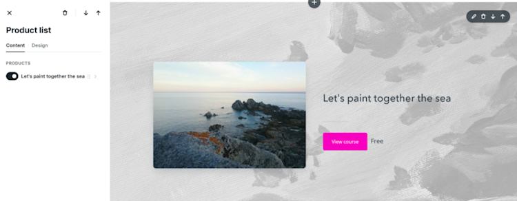
Select “Product list” in the left-hand column, then choose your product. Optionally, customize this section with the background image of your choice.
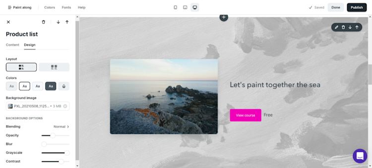
Choose the background image’s color: its opacity, blur, grayscale, and contrast to achieve the desired effect.
There’s more than one way to style the product section. Like Brittany Lewis, you could feature them side by side.
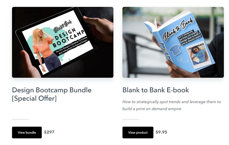
Or, like Whistle & Ivy, you can group them by category to keep your landing page clutter-free.

How many you feature depends on the focus of your landing page.
Step 3: Add testimonials
A crucial way to convince your audience is to get and feature better reviews. 72% of consumers say they trust a business after reading positive testimonials and reviews.
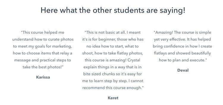
Fortunately, that’s easy to do; select “Testimonials” and then populate it with the fabulous feedback you’ve received.

You can share as many testimonials as you want, in one place or sprinkled across your landing page. Here’s how Crystal Hollman uses them to promote her Flatlay Method course.
Alex Wieckowski went for a shorter approach to his testimonials, with Twitter handles instead of full names.
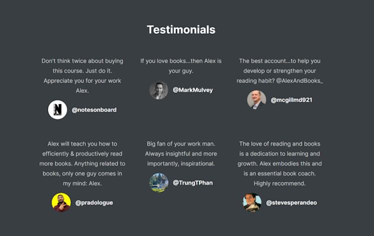
Twitter handles add a level of credibility to the testimonials as you can check that they’re real people.
Step 4: Add a video
Videos are a fantastic way to push your customers into clicking “buy”. Indeed, landing pages with videos drive 86% more conversions than those without.
Puppy School Online placed a video at the top of their landing page so visitors can see the training in action.
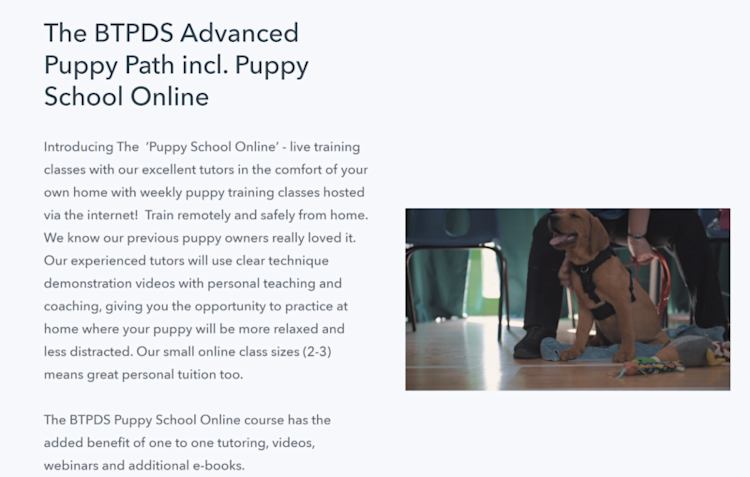
You have two options for adding a video to your landing page: upload it or embed it.
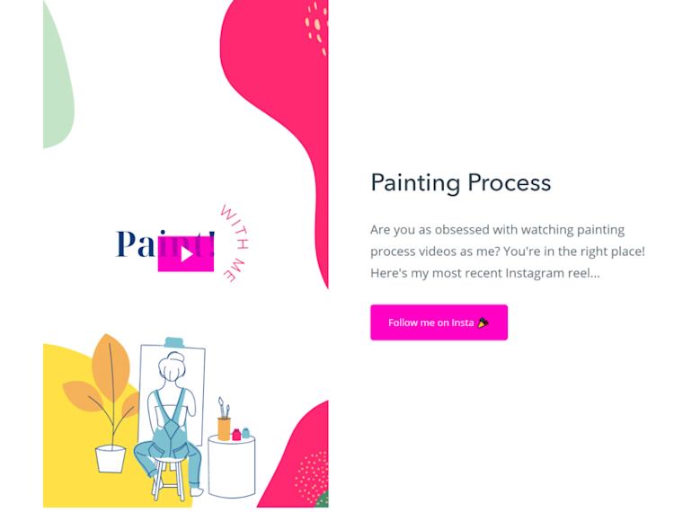
Let’s look at the first option and upload a video as well as your thumbnail of choice. Click on the “Video” block, then drag or upload a video file. Below it, you can upload an image file as your thumbnail.
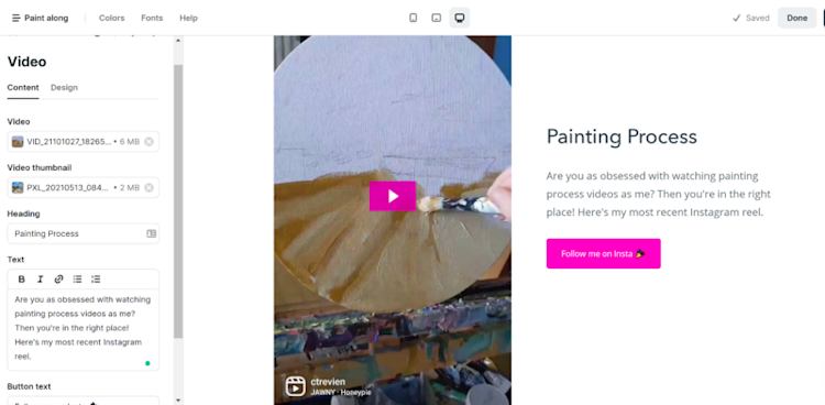
As you can see, even vertical videos like Instagram Reels upload fine on the page builder.
P.S. The thumbnail won’t appear in the site editor, but if you click “Publish” and then “View Site,” you’ll see it’s uploaded perfectly.
You can also embed a YouTube video into your landing page. Paste the link to your video in a text box. In the site editor, it’ll look like a plain link.
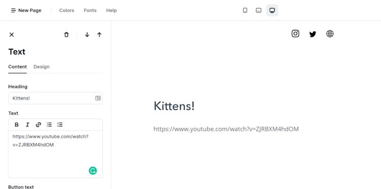
But once you hit “Publish” and then “View Site,” you’ll see it’s embedded.

(Adorable thumbnail credit to the Kitten Lady.)
You can add or host as many videos as you need to on your landing page.
Step 5: Capture emails
Use your landing page as an opportunity to build your email list and nurture your visitors through your newsletter.
Choose the “Newsletter” section and add text so they know what they’re signing up for.
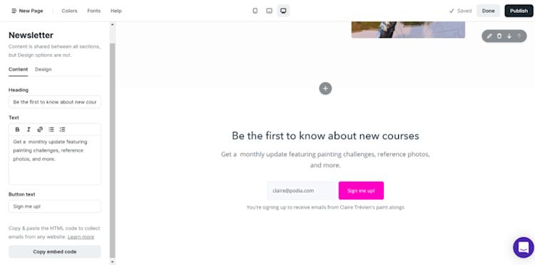
You can also copy the embed code and paste it on the rest of your website, even if you’re using WordPress or Wix.
To modify the text that appears below the “Sign me up!” button, head over to Site Settings > Email to edit it.
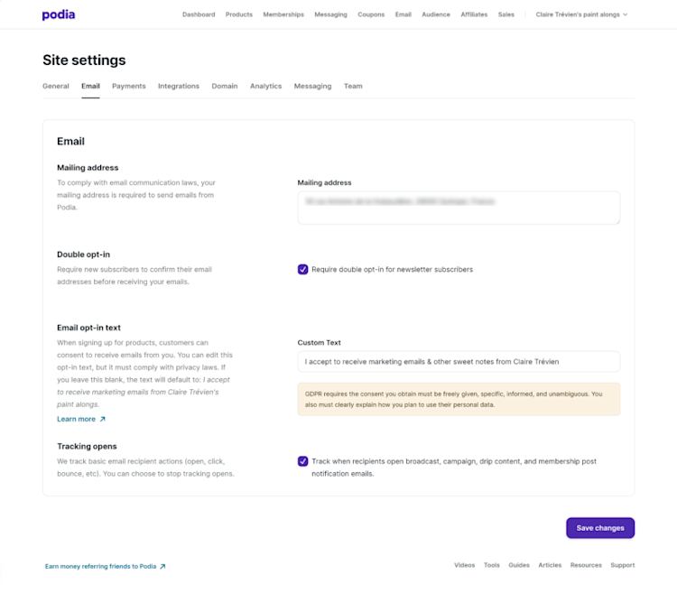
Pro tip: Be GDPR compliant by making it clear what people are signing up for.
Step 6: Add FAQs
Give your visitors every opportunity to say “yes” by answering their questions before they’ve even asked them.
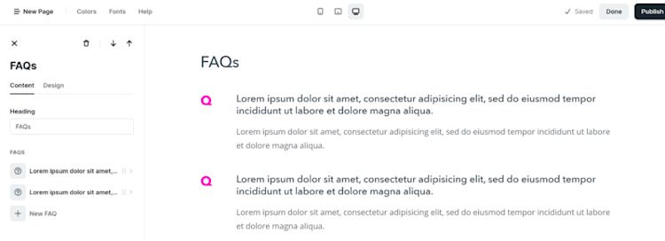
Add an FAQ section to your landing page from the left-hand side editor, then populate it.
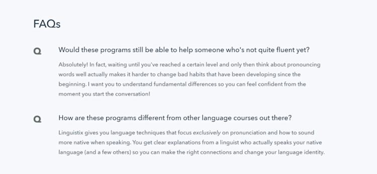
Here’s how a live FAQ looks like on the Linguistix site.
If you need ideas for what to add to your FAQ, here are a few ideas.
Check the questions that keep cropping up for customers. If you’re just starting out and don’t have customers yet, focus on practical questions such as “how long does the course take?” or “which device/materials do I need to take part?”
Step 7: Add a bio
Humans trust other humans, so add a face to your landing page.
Writing about yourself is the absolute worst. But the good news is you only have to do it one time. Once your bio is locked and loaded, use it on any Podia page without copy and pasting it.
Choose “Bio” and then have fun with all the different design choices available.

You can also add a background image and change the colors of your bio to match those of your landing page.
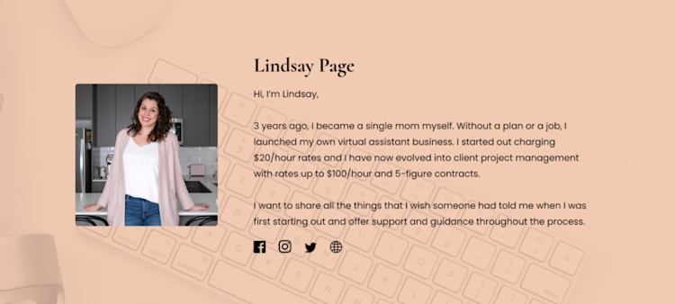
Here’s how Lindsay Page’s bio looks — it’s short and sweet and has plenty of links if a visitor wants to find out more.
As you can see, creating a landing page in Podia takes no time at all — and you can do it totally free. Sign up for your free 30-day trial to get started.
Create your dazzling landing pages today
Landing pages are a powerful way to convince site visitors your business is perfect for them. Luckily, it’s easier than ever to create a landing page without knowing how to code.
There are hundreds of thousands of landing page builders out there. Making the right choice can sometimes feel overwhelming.
The five most suitable for creators include:
-
Podia for an all-in-one solution for your courses, webinars, memberships, and digital products.
-
Carrd for a simple and easy page to test the waters.
-
Leadpages to A/B test gorgeous landing pages and pop-ups.
-
Instapage if you want to use heat mapping to optimize your landing pages.
-
Unbounce if you’ve got a marketing background and an extensive online audience.
Stop hiding your business from your customers — create your own landing page today so they can see how much you have to offer.
We can’t wait to see what you’ll create.

