After hours spent crafting your email newsletter, you’ve at last sent it to your subscribers.
But not a soul has clicked on your links.
This is disheartening, especially after all that work, but don’t give up just yet.
With just a few tweaks, you could improve your situation and rapidly boost your click rate. In this article, we’ll talk you through what could be holding your email back and how to change that situation.
Your email list is out of date
Just like your teeth, your email lists need a regular clean.
When you’re growing your email list, it’s tempting to cling on to every subscriber, whether they’re still reading your emails or not. I’m here to tell you that it’s time to let them go.
Newsletters aren’t just about how many people subscribe. Besides this, your idea of what a successful list looks like could be skewed.
If you have 250 subscribers or more, you’re already in the top 10% of creators.
So if your click rate is low, one reason could be that you’re not sending your emails to the right audience. Prune your low-performing subscribers and make room for new ones.
Here are two fantastic techniques to help you populate your list with the right people.
Create lead magnets
You need the right tools to attract the right audience, and it doesn’t get much more powerful than lead magnets.
Lead magnets are products you offer to your audience, generally for free, in exchange for their contact information.
But there are a couple of things you need to bear in mind for them to be effective.
First, for your lead magnet to be effective, it needs to be useful and wanted by your target audience.
For instance, Korrine Johnson of Travel Biz Boss helps freelancers launch their travel businesses. Her lead magnet is a free email template bundle.
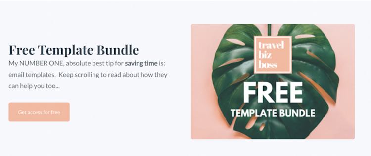
It works for her target audience because it’s helpful to them. Sales email templates will save her audience valuable time as they launch their business.
Here are some other ideas:
-
If you teach social media marketing, offer a downloadable guide to designing social media graphics.
-
If you help businesses improve their customer service, offer customer service chat templates.
-
If you help authors write novels, offer a checklist for submitting it to an agent.
-
If you are an AdWord specialist, offer a webinar to guide beginners through the basics.
The other important consideration is to let your audience choose whether they’re added to your mailing list or not.
Take math tutor Craig Barton, who offers this course for free as a lead magnet.
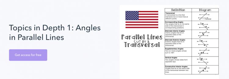
As the students sign up, they’re given the option to sign up for Craig’s newsletter.
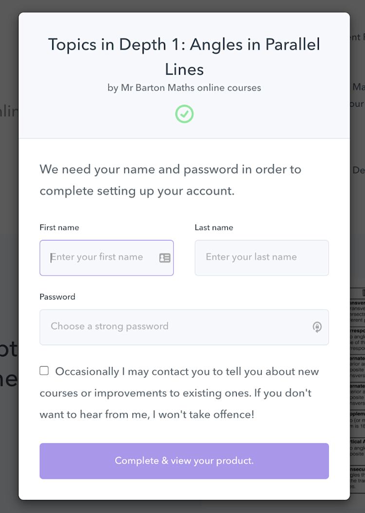
While lead magnets are a very effective way of building your newsletter, they have to be opt-in like Craig’s example. In other words, your readers must choose to subscribe rather than get signed up by default.
This is not just to keep you compliant with CAN-SPAN and GDPR. It’s also to make sure your newsletter has subscribers who want to be there.
Lead magnets are also an easy way to segment your email list into precise demographics. Segmentation is when you divide your mailing list into smaller groups to send them more relevant emails.
So, for example, you could send different types of emails depending on which lead magnet your subscribers have downloaded. Personalize your emails by including information specific to the download.
Only 14% of subscribers believe that the marketing emails they get are relevant to them. Unsurprisingly then, segmenting your email campaigns leads to a 100.95% higher click-through rate (CTR).
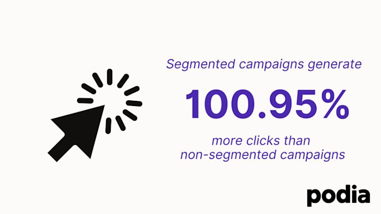
Here’s the gist:
Your lead magnets must be attractive, easily downloadable, and give readers the option to opt-in to your newsletter.
But once they’re in, there’s still work to be done to get them to stay.
Warm-up subscribers with a welcome campaign
The newsletter version of rolling out the red carpet is to send your new subscribers a welcome message.
Don’t skip this step. Welcome emails are extremely popular with readers with a 91.43% open rate.
They’re your opportunity to introduce yourself and your work but also emphasize the benefits of staying subscribed.
Here’s how Laura Atack of Encouraging Parents welcomes new subscribers. She tells them how glad she is that they’re there and explains what to expect. Being clear like this helps subscribers know if it’s the right newsletter for them.
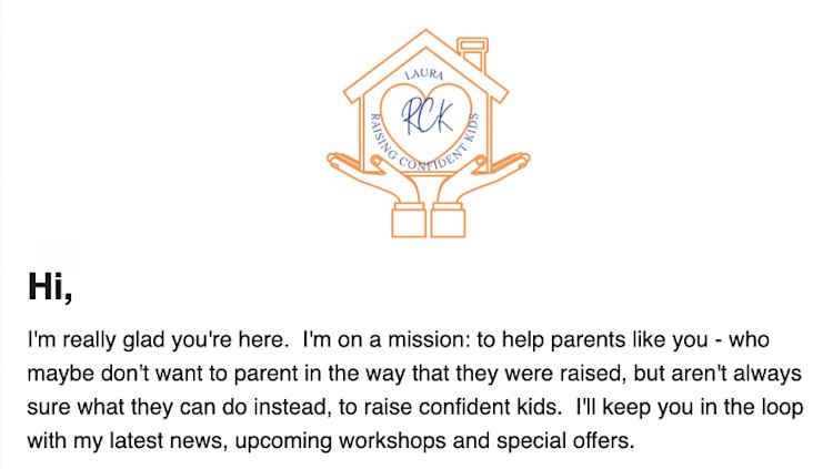
Once the introduction is made, she gets to the value part of the newsletter. Laura offers them a free digital download as well as three bonus items: a discount, a free discovery call, and a link to her Facebook group.
Like Laura, you can further convince your subscribers to stay with incentives so long as they are valuable to your audience. This is why she offers a range of options, one of which is bound to appeal to several people.
Takeaway:
If your email metrics show too many unresponsive subscribers, don’t be afraid to remove them and replace them with the right audience. Lead magnets combined with welcome emails will usher in a more engaged audience.
And while list cleaning can improve your click rate, so can a redesign of your emails.
Your emails need a redesign
Are you more likely to buy from a store if it’s cluttered or easy to navigate? It’s much easier to find what you’re looking for (or what you didn’t think you were looking for!) if a shop is well organized.
It’s the same with your email content. The path to a click needs to be focused and orderly.
So, if you’re not getting the clicks you’re after, it could be time to try a redesign.
For example, Campaign Monitor had a 127% increase in clicks after they redesigned their email from this:
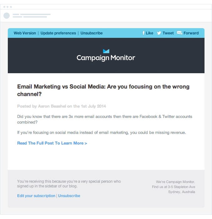
To this new design:
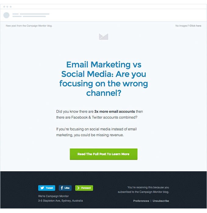
The most noticeable difference is that they now use a button to draw focus to their call-to-action (CTA). The logo header has also become much more discreet and no longer dominates. Instead, that’s the role of the hyperlinked title.
Compared to the old design, it’s much clearer where you should click and why.
The single-column format of the new design will make it easier to read on mobile devices, too. This is crucial as 70% of email recipients will delete an email if it’s not mobile-friendly.
Here’s another example of a simple yet effective design. Breizh Amerika’s newsletter consists of a simple image, a short introduction text, and a call-to-action button. It doesn’t need anything more to entice the reader to click.
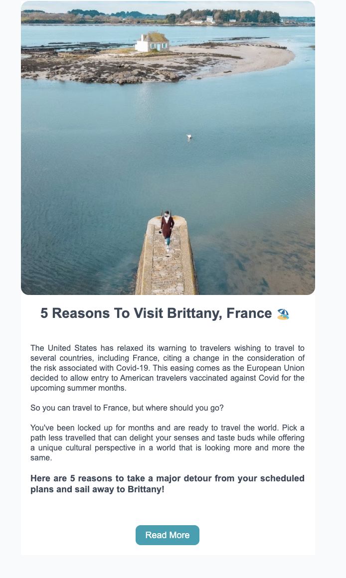
The journey to click is straightforward and even further emphasized by the choice of photograph. The stone jetty seems to point towards the CTA button.
But good design doesn’t have to involve breath-taking images. In fact, text-based emails result in higher click-through rates.
The Lazy Genius Collective’s newsletter by Kendra Adachi is text-driven and clearly organized, making it easy to read. In it, Kendra suggests different Amazon reading bundles paired with her books. This is to take advantage of a 3-for-2 special offer.

Her newsletter is easy to act upon, and the bundles make them useful for readers looking for gift ideas.
Plus, fewer things can go wrong with text-driven emails. They can be read easily on different devices, and the images won’t struggle to load or be distorted.
So if you want more clicks, look at what you could simplify in your design to encourage an increase.
If good email design is the journey, then call-to-actions are the destination. Here’s how to make them unmissable.
Your call-to-action isn’t clear
There’s a common culprit for low click rates, and it’s to do with your CTAs.
Having one clear CTA will be much more effective than trying to stuff too many options in every newsletter.
Indeed, an easy-to-spot CTA generates 232% more clicks — and it works best when it’s both a button and a hyperlinked anchor text.
So, for your next newsletter, design it around encouraging clicks to a CTA.
Inspire yourself from Veganuary’s newsletter, which links to its CTA in multiple places to increase the chances of conversion. It starts with an attention-grabbing clickable header.
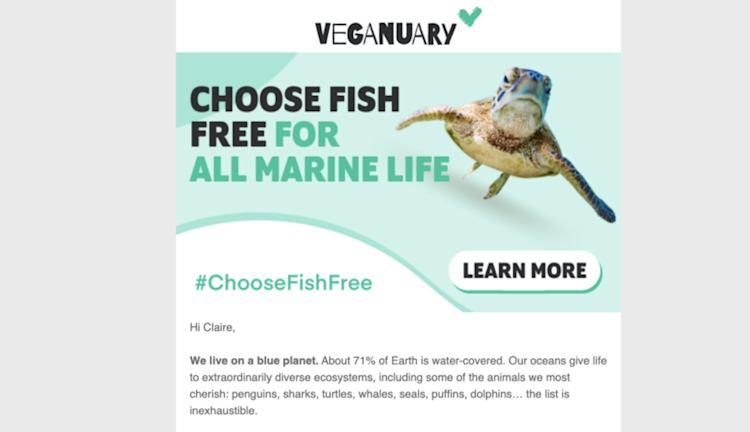
Then, to bring the message home, the link is also anchored to text in the body of the email.

Having a text and visual option like this means that if there’s any difficulty loading the header, at least one of the links will be easily clickable.
Your newsletter might be designed to have many links, for example, because it features a roundup section. If so, it’s a good idea to have a hierarchy of links. Choose your primary CTA to lead with and offer the rest as secondary options.
For example, Austin Kleon’s newsletter is designed as a list, but the first option is his primary CTA. It’s also featured as the subject line, preview text, and header image.
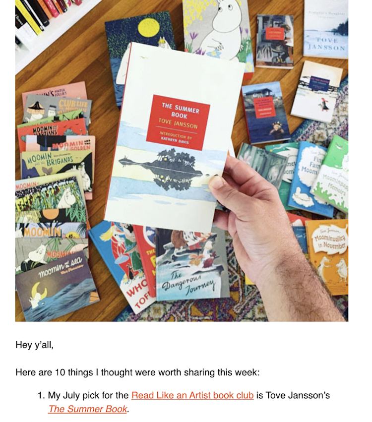
As it’s first on the list, it’s less likely to be missed by readers.
Plus, just because you have secondary CTAs doesn’t mean you can’t showcase them properly.
Katy Beauvais’s French Instinct newsletter features multiple sections. In each, she’s still careful to provide the reader with a choice for clicks: image, text, and button. Here’s one such section.
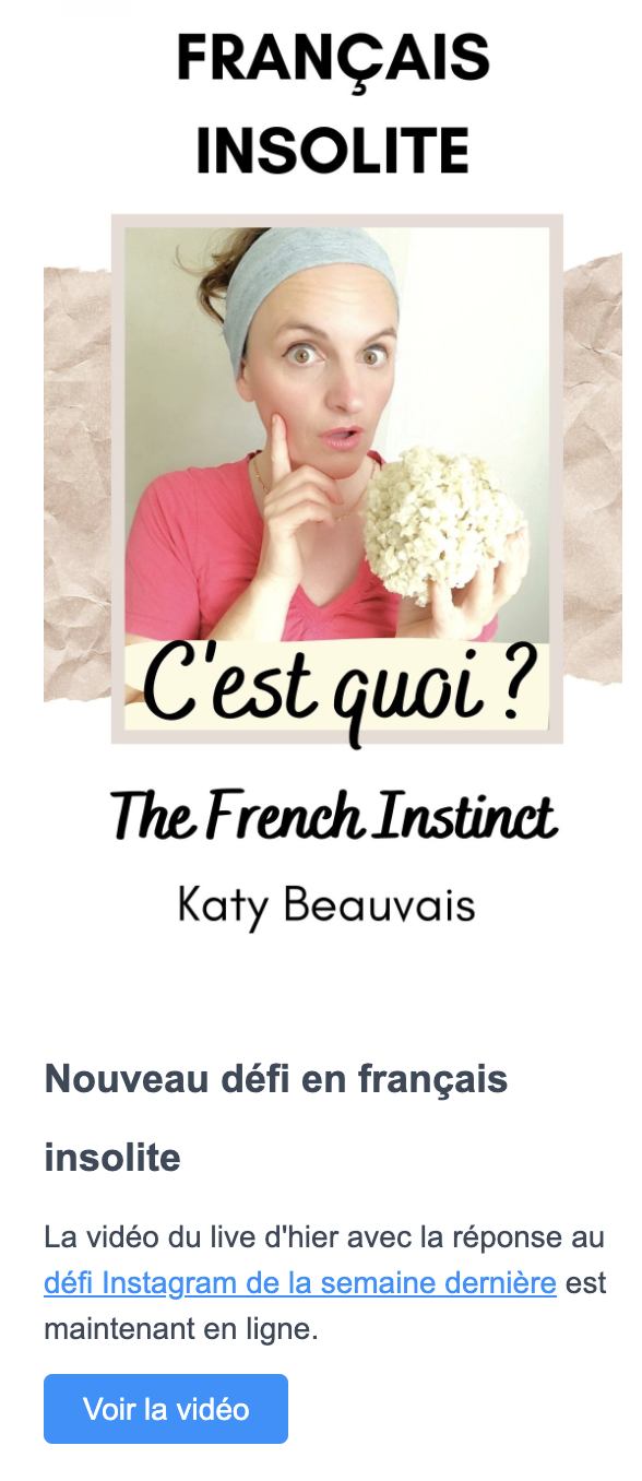
Essentially, to increase your click rate, include your CTA in multiple formats. This means your readers are more likely to spot and click it.
But to click your CTAs, they need to want to open your emails in the first place. This brings us to the next tip.
Your emails aren’t opened
If your click rate is low, it could be because your readers haven’t understood why they should open your emails.
Email subject lines do a lot of the heavy lifting with your email open rates. 35% of email recipients open messages based on the subject line alone.
Your subject line should convey in just a few words what your email is about and why your readers should care. When in doubt, a good option is to focus on the CTA.
This might sound a bit dull, but it doesn’t have to be.
For instance, here’s the approach of fitness coach Erin Stern. Her title refers to the main CTA of her email (early access to her new glute gains course).

As you can see, Erin gives her subject line a bit of a twist. She could have written a straightforward “Get early access to my glute gains course”, and that would have been fine.
Instead, she goes for a cheeky approach with a peach emoji and a bit of alliteration (“build your booty”). The emoji is a great idea as subject lines with an emoji lead to a higher CTR.
Her subject line shows off Erin’s personality and makes you want to click through.
This B2B Marketing subject line is another example of elevating your subject line. Their email is meant to encourage sign-ups to their webinar titled “Why webinars are a must-use tool for ABM excellence”.

They could have used that as a subject line, but instead, they went for this far more attractive option.
In just a few words, the subject line helps you visualize a transformation (from woe to wow), and you also know precisely what the topic is about (webinars and ABM).
Another strategy with subject lines is to build intrigue as book review site NetGalley does here.

This mini blurb of a book is designed to make readers want to click through. They want to know what careless mistake could tear a family apart.
There is a caveat, though: this approach works for NetGalley’s specific audience of book reviewers but wouldn’t necessarily in other industries. When in doubt, it’s better to spell things out rather than try to be clever.
If your email client offers this feature as an option, you could A/B test your subject line. A/B testing is when you send two versions of an email to a sample of your mailing list to see which one performs the best.
A/B testing is used by 58% of marketers to test out their theories and increase conversion rates.
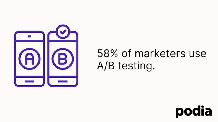
You too can use A/B tests to check which subject line works best. This is a great option if you’re hesitating between two different options.
Entice your subscribers with a subject line that has the right balance of information and interest, and they’re much more likely to click on your CTAs.
There’s a final option that could be getting in the way of a higher click rate, and that’s your own assumptions.
You don’t have a clear benchmark for your metrics
If you’re still not content with the number of clicks your newsletter is receiving, the problem could be with your internal benchmark.
When you’re working alone, it’s easy to fall into a comparison trap. You might think you’re underperforming compared to your competitors or overestimate what’s an average click rate. Instead, you should be focusing on your own goals.
Industry averages are helpful up to a point, as they can give you a solid metric to position yourself.
But, approach them with caution — they’re an indicator and not an immutable truth. They will also vary a fair amount depending on who is leading the survey and with what information.
The easiest metric to find industry benchmarks for is an average click-through rate (CTR), which is the total number of clicks an email receives divided by the number of emails delivered. Here’s the formula:
(Number of email clicks / Number of emails delivered) x 100 = CTR
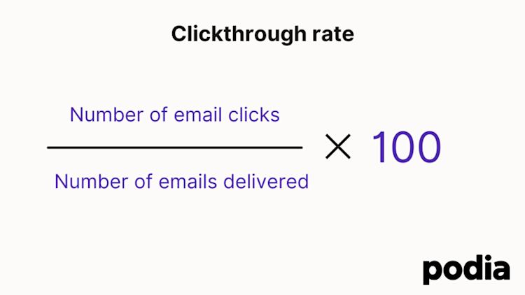
So if an email received 12 clicks and were delivered to 320 people, your email click-through rate would be 3.75%
You can find several benchmarks online to compare your email CTR to, such as this one.
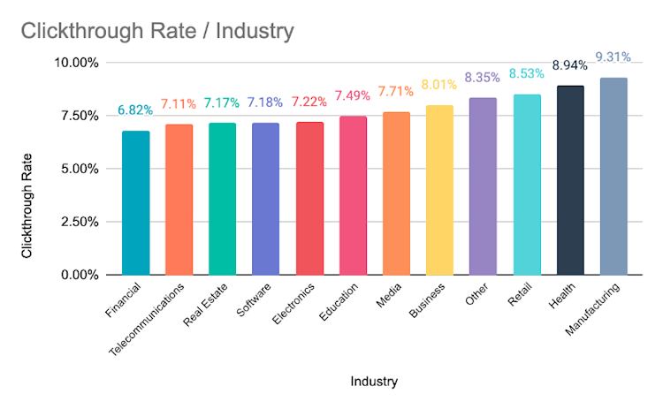
But, as we’ve seen earlier, lists can be full of unengaged users, so a CTR metric isn’t always helpful.
A more important metric than CTR is a click-to-open rate (CTOR). This measures your click rate based on those who’ve opened your email rather than your whole subscriber list.
Here’s your formula to calculate your CTOR:
(Number of email clicks / Number of emails opened) x 100
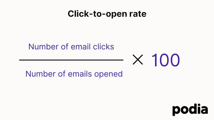
So if you’ve had 12 clicks in an email opened by 56 people, your CTOR will be 21%.
An average CTOR across all industries is 14.3%, but your industry-specific CTOR will likely differ.
Again, email marketing benchmarks are there to guide you rather than demoralize you. And, ultimately, they’re all meaningless if they’re not related to your goals.
Perhaps one click is all you need to secure the sale that will keep your business running for months. Maybe twelve clicks are sufficient to sell out your next masterclass.
No one else but you can dictate what the right email marketing metrics are for your business.
Once you are clear about your goals, set yourself a realistic target for click rates that aligns with your business. Then you’re ready to create your next successful email campaign.
You can transform your next email marketing campaign
There are several reasons why your average emails aren’t receiving the clicks you want.
Here are a few ways to increase your email engagement:
-
Give your email list a prune by removing unengaged subscribers and replacing them with your target audience. Use lead magnets and welcome emails to encourage new subscribers.
-
Redesign your message following email newsletter best practices to simplify your reader’s journey and create better emails.
-
Be clear about your CTA and give your subscribers multiple opportunities to click through to it.
-
Link your subject line to your CTA to encourage a higher open rate.
-
Check your industry benchmarks for click rates and clarify your own goals to set yourself a realistic target.
As with all content marketing, the results of your efforts might not be immediately apparent. But if you consistently follow this path, your click rates will keep growing, and with it, your business.
